Positions, stacking & swiping
Control where toasts appear, how several toasts are laid out, and how they are dismissed.
Positions
Set the default position on the host and override it per toast.
<ToastHost position="bottom-center" />;

toast('Centered', { position: 'center' });
Positions: 'top-center' (default), 'bottom-center', and 'center'.
Offset
offset is the distance from the safe area edge a toast is anchored to. Pass a number for both edges, or { top, bottom } to set each one. An omitted edge defaults to 8, or 16 when the device has no safe area inset on that edge. center toasts ignore it.
<ToastHost offset={16} />

// Keep bottom toasts clear of a tab bar.
<ToastHost offset={{ top: 8, bottom: 80 }} />
Keyboard
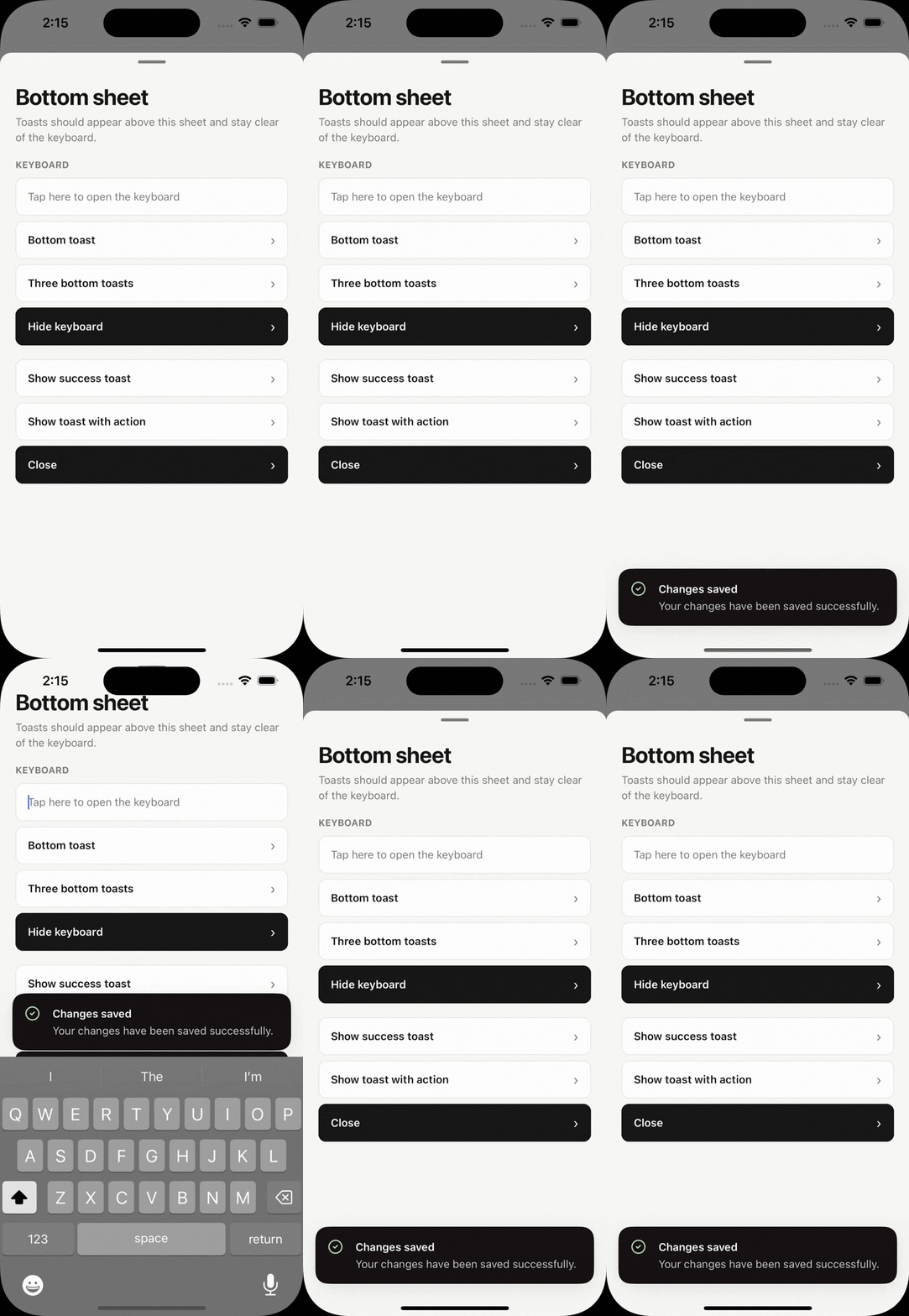
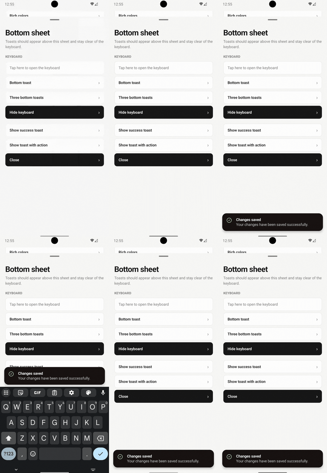
Toasts never take focus, so an open keyboard stays open and the focused input keeps receiving text. Bottom toasts stay clear of the keyboard.
Listing and stacking
By default, concurrent toasts are listed with gap (14) between them. At most visibleToasts (3) toasts are shown per position; older toasts are dismissed.
enableStacking collapses toasts into an overlapping deck. Add expandOnPress to expand a collapsed stack when its front toast is pressed.
<ToastHost enableStacking expandOnPress visibleToasts={4} />Swiping
Toasts can be swiped away in one direction, 'up' by default. Dragging the other way meets elastic resistance.
<ToastHost swipeToDismissDirection="left" />Close button
<ToastHost closeButton />;

toast('Has a close button', { closeButton: true });